Dribbble · Design Systems Course
IPTS Design System: Building for Scale Across a Galactic Ecosystem
A Dribbble capstone project challenging me to design, document, and stress-test a scalable design system for IPTS — a fictional galactic transit corporation spanning three distinct websites. The system was then put through a full product-wide rebrand to prove its durability.
Timeline
March – April 2023
Responsibilities
Design System Architecture, Component Design, Style Guide, ZeroHeight Documentation, Rebrand Challenge
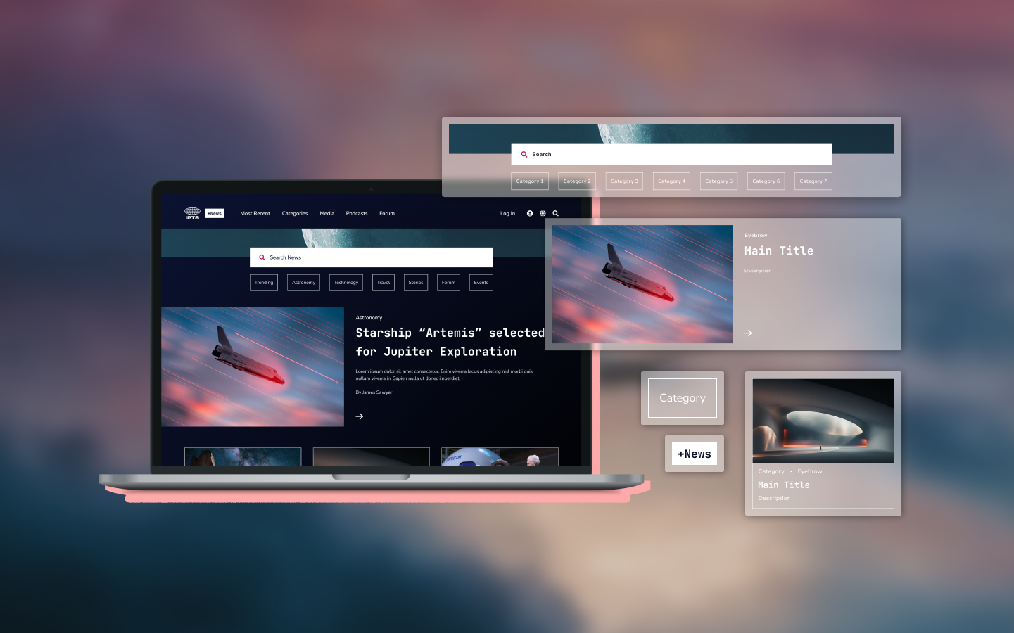
8 Weeks
of Structured Learning
5+
Reusable Components Built
3
Sites Supported
100%
Rebrand Test Success Rate
01 · Challenge
Three distinct websites. One design language. Zero redundancy.
Design Problem
IPTS operates three separate websites — ipts.org, IPTS Travel, and IPTS Rail — each serving different user needs. Without a shared component library, any design change would require rebuilding from scratch across all three, creating fragmented experiences and wasted effort.
Scalability Problem
With separate websites for travel planning, rail booking, and news content, the system needed to balance standardization with flexibility—supporting distinct user journeys without creating redundant components.
Durability Problem
Design systems should outlast the visual identity they support. A key project goal was proving that the entire experience could be rebranded through system-level updates rather than rebuilding components from scratch.
Learning Goal
Beyond the brief, this project was a personal investment in systems thinking. I enrolled in the Dribbble Design Systems course to deepen my understanding of how to design for efficiency, consistency, and scalability — skills that translate directly to real-world product work.

IPTS Logos — the only asset supplied by the Dribbble course and the starting point for the project's design language.
02 · Insights
Discovering a design system strategy.
Before creating any components, I explored design system best practices and key course learnings to approach the design phase with greater confidence and intention.
Reuse before redesign
The most efficient systems share atoms upward — buttons, typography, and color tokens defined once and consumed everywhere, rather than reimplemented per component.
Look for overlapping functionality
By auditing existing site pages and/or competitor products for recurring patterns, we can identify the components most likely to be reused across the product ecosystem and prioritize design efforts where they will have the greatest impact.
Start with the most complex, known variation
Designing the most feature-rich version of a component first — like a search bar with integrated date pickers — ensures the system accounts for all necessary atoms from the start.
Documentation is part of the design
A component no one knows how to use is a component that will be misused. Clear usage guidelines with real-life implementation examples ensured the system would be accessible to future contributors.
03 · Journey
From research to rebrand.
Click any card to explore the thinking behind each phase.

Research
Brand Research & Audience Definition
Establishing the DNA of IPTS through targeted brand questions.

Research
Competitive Set Analysis
Reviewing news, travel, and rail websites to extract scalable design patterns for complex digital platforms.

Strategy
Feature List
Mapping overlapping functionality across all three sites to identify components that could scale universally.

Strategy
Component Candidates
Sketching structural placeholder shapes to validate reusability before investing in visual design.
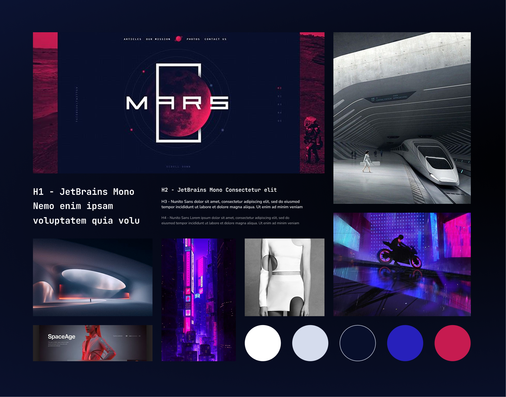
Design
Style Guide & Mood Board
Establishing a retro-futuristic aesthetic with a dark color scheme, defined typography, and atmospheric imagery.
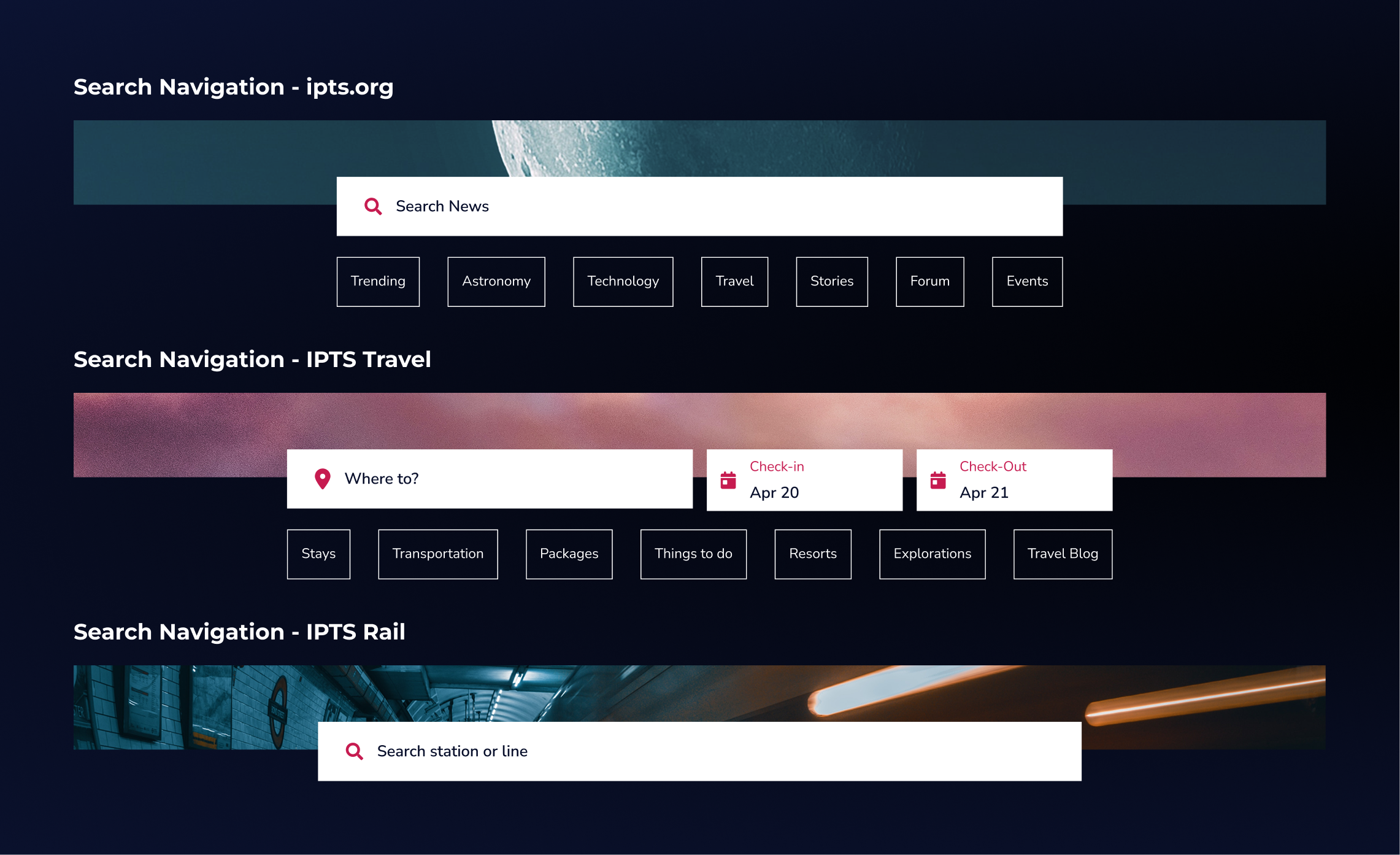
Design
Hi-Fi Wireframes & Component Library
Designing components simultaneously across all three sites to ensure consistency and surface reuse opportunities in real time.

Documentation
ZeroHeight Documentation
Chronicling every component with clear descriptions, usage guidelines, and real-world application examples.

Validation
Rebrand Challenge
Stress-testing the entire system by executing a complete product-wide visual rebrand — without rebuilding components.
04 · Solution
A design system that proves its value through rebrand.
The IPTS system prioritizes token-based architecture, multi-site reuse, and documentation-as-design.

ADAPTABLE COMPONENTS
Reusable components designed to flex across three distinct sites.
Each component was designed for its most complex use case first, then simplified for lighter contexts. Navigation, search modules, card layouts, footers, and form elements were all built as shared components — adapted contextually, never rebuilt from scratch.
Working simultaneously across all three sites during design revealed reuse opportunities that a sequential approach would have missed.

COMPONENT DOCUMENTATION
ZeroHeight chronicles that make handoff effortless.
Every component in the system was documented with usage guidelines and real-world implementation examples from within the IPTS ecosystem. The goal was to write documentation that a new contributor could act on — not just read.
Clear "why and how" documentation reduces design debt by eliminating ambiguity around when and how components should be applied.

REBRAND STRESS TEST
The full system rebranded without rebuilding a single component.
By building on Figma token libraries from the start, the rebrand challenge became a validation exercise rather than a reconstruction effort. Color tokens, text styles, and component aesthetic tweaks updated globally — and the system held.
This proved the system's core promise: a well-architected design system reduces future design effort rather than compounding it.
05 · Impact
What a well-built system makes possible.
Because this was a learning project, impact is measured through design quality, system durability, and the UX methods that would validate it in a real-world context.
5+
Reusable components
3
Sites unified
1
Full rebrand, zero rebuilds
100%
Token-driven architecture
Design Quality Outcomes
Consistent visual language established across all three IPTS sites
Component-first approach eliminated redundant design work
Rebrand challenge completed without reconstructing any component
Documentation provided clear usage guidelines for future contributors
How I Would Measure Real-World Impact
Design velocity: track time-to-ship for new features before vs. after system adoption
Component adoption rate: % of new designs built using library components vs. one-off custom
Design inconsistency audits: reduction in visual discrepancies across pages over time
Cross-team usability: survey designers and engineers on system comprehension and ease of use
Strategic Learnings
Token-based architecture is the single highest-leverage investment in any design system
Designing complex variants first prevents rework when simpler variants are derived
Documentation is not a deliverable — it is part of the design process itself
Working across multiple products simultaneously surfaces reuse that sequential work misses
06 · Reflection
What building a design system from scratch taught me.
When to Create Components
Building a component library is a significant investment of time and effort, so it's critical to spend that energy wisely. This project taught me to look carefully for recurring patterns — whether in an existing product or future designs — before committing to a new component. The goal isn't to componentize everything; it's to prioritize the components that will be reused most often and deliver the greatest return on that investment.
Design 80-20
One of the principles I'm most excited to carry into my day-to-day work is the 80-20 rule: roughly 80% of future design work should be built from existing components, leaving the remaining 20% for creative problem-solving. This balance brings speed and consistency to the work while still leaving room for innovation exactly where it matters most.
Documentation is Design
The ZeroHeight chronicles changed how I think about handoff. Writing clear, example-driven documentation is a design skill — and one that directly determines whether a system gets adopted or abandoned.
Don't Get Caught Up in the Details
In the past, I'd try to imagine every possible scenario a component might encounter before building it — causing delays for unnecessary complexity. This project shifted my approach: design for how a component is used today, not every way it might be used someday. Component libraries are living documents, and they'll keep evolving as the product does.
Next Project